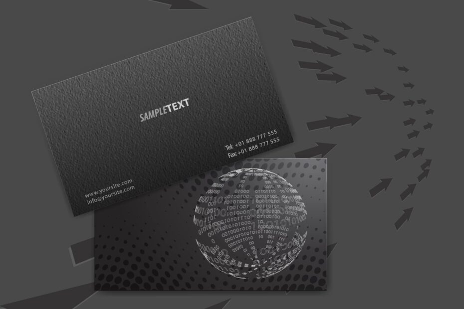
Creating an effective business card is a very important part of any marketing strategy. While it is true that as many as 80% of business cards get tossed aside that is no excuse of taking it lightly. Think of this, you have less than 5 seconds to make an impression to a potential “my best customer”, are you really going to hand that person some thing that looks and feels cheap, is that your goal. There are many, many choices for cards and just as many choices to make yours pop and stand out. Here are a few examples of and thoughts
- Fonts matter !! You want something that mimics your business but don’t forget you are not the one reading it. Your clients want something easy to read and so do you.
- Having your name, phone, address, and email are all essential pieces of a business card. Don’t overdue the text on your card. Think of it like a living room, too much clutter and furniture and everything gets lost, sometimes less is more. Don’t overwhelm your card.
- Don’t be afraid of going full color and special finishes, you might find it actually gets the conversation started. Try finishes like UV coating, foil or even a soft suede feel.
Remember your card is your first point of contact with someone when you are networking, MAKE IT COUNT.
Questions, come visit our design staff and change your look for less than you think.

